
The Psychology of Colour in Branding: How Designers Create Memorable Visual Identities
One of the first things consumers notice about a brand is its color. Before reading a tagline or understanding a product, audiences often form an impression based on the visual language presented to them. This is why colour psychology in branding has become an important part of modern graphic design. The right combination of colours can communicate trust, energy, sophistication, creativity, or freshness while helping a brand establish a memorable identity.
For students exploring graphic design, understanding the relationship between colour and human perception is an important part of developing strong visual communication skills. Design is more than just making things appear good. It is also about understanding how visual choices influence the way people see and remember a brand.
Understanding the Psychology Behind Colour
Different colours can create different emotional associations, although their meaning can vary depending on context, culture, and audience. Blue is often associated with trust and reliability, while red can communicate energy, excitement, and passion. Green is commonly connected with nature and freshness, whereas black can create a sense of sophistication and premium quality.
This makes colour selection an important strategic decision in branding. A designer needs to consider the message a brand wants to communicate and select colours that support that personality. A technology company may prefer a clean and trustworthy palette, while a creative brand may choose brighter and more expressive colours.
Students learning graphic design are encouraged to look beyond personal preferences and understand why a particular colour works for a specific audience and brand.
Colour and Brand Identity
A strong brand identity is built through consistency. Colours used across a logo, website, packaging, advertisements and social media can create a visual connection that makes a brand easier to recognise.
Some of the world’s most recognisable brands have developed strong associations with their signature colours. Over time, these colours become part of the brand itself. This demonstrates how effective colour selection can transform a simple visual element into a powerful branding asset.
For students pursuing graphic design courses in Chennai, understanding brand identity and colour systems can provide valuable insight into how professional designers develop consistent visual communication across different platforms.
The Role of Colour in Logo Design
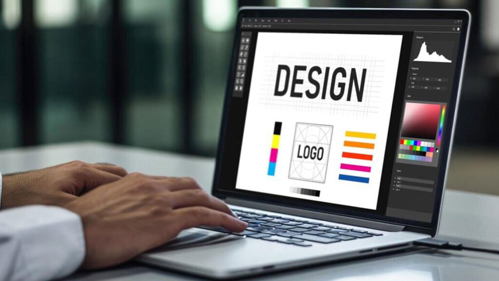
Logo design is another area where colour psychology becomes particularly important. A logo needs to communicate a brand’s personality quickly, often within just a few seconds. The colour chosen for that logo can influence how the brand is perceived.
A green logo may support a brand associated with sustainability or natural products, while yellow can create a feeling of optimism and energy. Darker colour palettes can communicate sophistication, while vibrant combinations may create a more youthful and energetic identity.
However, effective logo design is not simply about assigning a meaning to every colour. Designers also need to consider contrast, readability, shape, typography, and how the logo will appear across different applications.
How Designers Use Colour in Visual Communication
Colour plays a role far beyond logos. It influences advertisements, websites, packaging, social media creatives, presentations and video content. Designers use colour to create visual hierarchy, guide attention and separate important information.
This is where practical design knowledge becomes important. A colour that works beautifully on a poster may not produce the same result on a website or video. Designers need to understand how colours behave across different digital and print formats.
For learners attending graphic design classes in Chennai, practical exercises can help develop this understanding by allowing them to experiment with palettes, layouts, and different forms of visual communication.
Colour Psychology in Digital and Video Design
The influence of colour extends into digital media and video production as well. In video editing, colour grading can change the atmosphere of an entire scene. Warm tones can create a sense of comfort or nostalgia, while cooler tones can establish a more dramatic or mysterious mood.
This connection between graphic design, branding, and video makes colour knowledge valuable for students interested in broader creative careers. Those exploring a video editing course in Chennai can benefit from understanding how colour correction and grading contribute to visual storytelling.
A strong understanding of colour allows editors and designers to make creative decisions that support the message, mood and identity of a project.
Learning Colour Through Practical Design Training
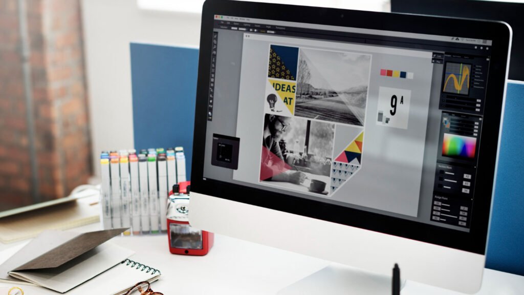
Colour theory becomes more meaningful when students have opportunities to apply it to real creative projects. Working on logos, posters, advertisements, social media campaigns and brand identity projects allows learners to understand how colour decisions affect the final communication.
A structured learning environment can also help students experiment with different combinations and understand the importance of contrast, harmony, balance, and visual hierarchy. These practical experiences can help develop confidence and encourage students to think like professional designers.
For anyone searching for graphic design training in Chennai, practical exposure to branding, typography, layout and colour theory can be an important factor when choosing a design program.
Building a Career in Graphic Design
Graphic design offers opportunities across branding, advertising, digital marketing, publishing, social media, UI design, packaging and other creative industries. As businesses increasingly depend on strong digital identities, skilled designers continue to play an important role in communicating ideas visually.
Developing a strong portfolio can help aspiring designers demonstrate their creativity and ability to solve visual communication problems. Projects that show thoughtful use of colour, typography, composition, and branding can help communicate a designer’s approach to potential employers and clients.
Students looking for a graphic design institute in Chennai can benefit from choosing training that combines design fundamentals with practical project experience and exposure to current creative workflows.
The Future of Colour and Visual Branding
Colour will continue to play a central role in this process. New digital platforms and creative technologies may change how designers work, but the fundamental principles of colour, composition and visual communication will remain relevant.
Understanding why a colour works can therefore be just as important as knowing how to use it.
Start Your Journey in Graphic Design
Colour is more than a decorative element. It can communicate personality, influence perception and help audiences recognise a brand. When combined with typography, composition, imagery and storytelling, colour becomes one of the most powerful tools available to a designer.
For students interested in developing professional creative skills, learning colour psychology alongside practical design techniques can provide a strong foundation. Whether you are exploring graphic design courses in Chennai, graphic design classes, or video editing, understanding how visual decisions influence audiences can help you create work that communicates with greater purpose and impact.